Less is More
I have just released Bumble Bots v2.0, which is the end point, at least for now, of an interesting journey.
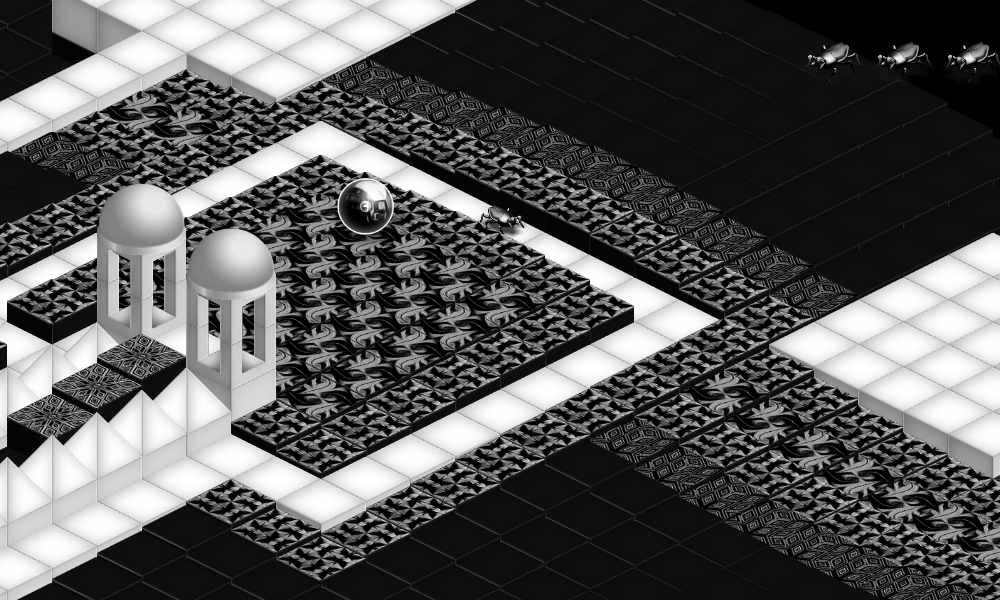
The journey started with the Global Game Jam 2017. The theme of that year was "waves". Together with my brother and a friend, we created the game Rolmops. In this game, part of the ground is moving in a wave-like fashion. This matters, as the player and enemies can only move downwards. The graphics are detailed and highly Escher-inspired.
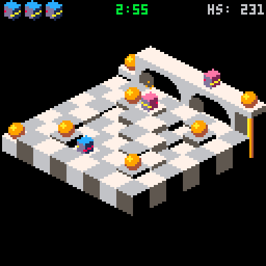
I used these ideas to create Bumble Bots for the PICO-8 console. This console only has a 128x128 resolution, so it required a complete redesign of the graphics. At the outset, I did not know if the game could be ported successfully to such a small resolution, but it could.
Next, I got myself a Gamebuino console and decided to port the game to there. This required shrinking the game further, as this console has a screen size of 80x64. I could re-use the same sprites, but had to zoom into the levels and let the camera follow the player. Furthermore, I had to reduce the screen clutter. The result was a success. The game was fun to play.
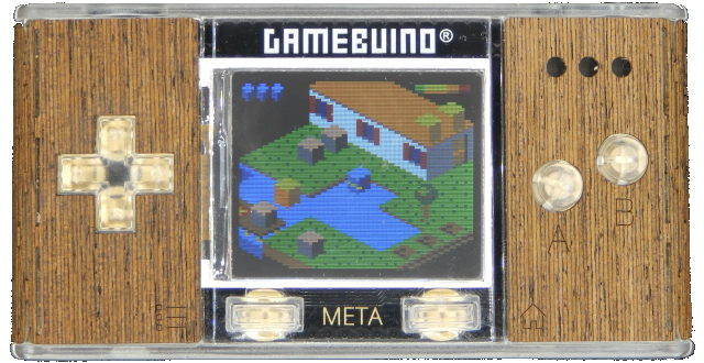
In fact, at the lower resolution, the game play was more immersive, partially because the screen showed far less empty space. Surprisingly, I liked this lower resolution variant better. So this triggered me to create a lower resolution variant for the PICO-8 as well: Bumble Bots Low Rez. This meant going further down in size, from 80x64 to 64x64.
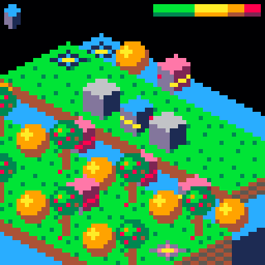
I like these latest, low rez, versions of the game the best. Less pixels is better game play it seems!
Interestingly, the screen size of this final version of the game is less than the resolution of individual sprites from the original Game Jam variant of the game.
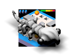
Bumble on!

Leave a comment
Log in with itch.io to leave a comment.